 |
| Good times at WonderCon |
I am convinced that 90% of design is problem solving.
"What sort of problems?" do you ask, friend?
Is the action reading?
Is the color treatment adding to or subtracting from the focal point?
Why does this nose look like a mushroom?
Is the story clear?
Do I need another mouse in the house reading Goethe's Faust
?
The problems are approached (and solved) before the piece is begun, while the piece is materializing (be it in paint, paper, or digital medium), and after the piece is finished. This, in whole, is the design process. What separates the professional designer from the tortured artist is the ability to solve these problems in a satisfactory manner in the
before and
during phases within a given timeframe.
Is there a point in one's artistic maturity in which one has successfully culminated from tortured artist and metamorphosed into consummate professional? Ask me at my deathbed, but I'm pretty sure the answer's
"No."
So for WonderCon (and all future conventions--stay tuned ~_^),
illustrious colleague and I wanted a pair of banners that both portrayed our respective approaches to illustration and showcased our collaborative work. So it started here:
 |
pencil
(i think....) |
We liked the idea of a swooping line connecting our two banners. An idea inspired by
a previous piece.
 |
| digital |

 |
| watercolor & gouache |
 |
| paper, watercolor & gouache |
Alas, when it was finally worked up, we felt that, yes, the swooping clouds connected the banners, but the connection felt too fragile. The differences in not just color and material but in the two completely separate stories made our banners feel disconnected.
The final was pleasing to behold, yet we were still displeased.
So we moved on to a banner concept where the story of one told the story of the other.
 |
| paper, watercolor & gouache |
This one told a satisfactory beat-1 to beat-2 story, punchline and all, and we were ready to run with it, when at the eleventh hour I sent illustrious colleague a silly email with this attached.
 |
digital and pencil
(i'm pretty sure this time....) |
Both of us were like "I like the first octopus a lot, but....oh no, I LOVE the second octopus."
And then there were a series of emails that were very much a back-and-forth of
"Should we just go for it? I think we should go for it."
"Totally need to go for it."
"You think it's worth doing? We're already out of time...."
"Totally worth doing."
The back-and-forth really was necessary because it really was the eleventh hour, and we were going to take it to print that day. Stinkin' artists. No respect for their deadlines. Tsk tsk.
 |
| watercolor & gouache |
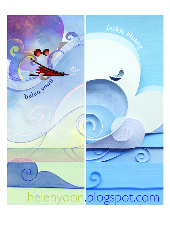
So here was the final painting for our third banner concept. But, when we finally put it together....
 |
| paper, watercolor & gouache |
I felt that our second banner concept had a story that read fluidly but the two still felt too dissonant. I had thought it was because the palettes were too different, so I compensated this round by going way cool for my banner's side.
Illustrious colleague noted that it looked fine as a stand-alone painting, but, when placed side-by-side with its other half, a wispy watercolor painting felt unfinished against the solid, graphic color of the paper. And I missed the warmth.
 |
digital, paper, watercolor & gouache
printed at banners.com |
And so, our lovely little banner duo was born.
The moral of this story?
If at first you don't succeed,
Fry, fry a hen.
Also: waste not!


